HABIT
PLANET
Transform your life, one habit at a time.
Section 01 · proposed · extracted from now.md + app source
Brand Overview
A free habit tracker where your progress orbits — and where you leave yourself video Mementos along the way.
Habit Planet is a free, local-first habit tracking app: pick your habits, check in daily, watch a small planet system fill with your progress, and record one-minute video memos — Mementos — to capture what the day actually felt like. It gamifies discipline gently: experience points, one hundred levels, an emoji rain when you level up.
- Mission [proposed]
- Make keeping a promise to yourself feel like watching a planet come to life.
- Vision [proposed]
- The habit record you'll actually rewatch: a year of your own face telling you it was worth it.
- Audience
- People building better daily routines — self-improvers who want tracking without a subscription or a guilt trip. [context: now.md pitch; no named personas exist — ICP run pending]
Personality
- Encouraging
- "Track your progress and watch yourself flourish." Support is the default register. [context: now.md]
- Honest
- Try to check tomorrow's habit and the app says: "You're a liar, that's in the future." No vanity streaks. [context: habit_entry_card.dart]
- Cosmic
- Progress is drawn as orbits, ripples, and breathing rings — a small solar system of your own making. [context: orbital_indicator.dart]
- Playful
- Emoji are first-class citizens; leveling up literally rains 🎉. [context: level_up_overlay.dart]
Construction principles — live
🏃 Morning run — day 12
"You're a liar, that's in the future."
Section 02 · proposed · mark extracted, rules invented
Logo System
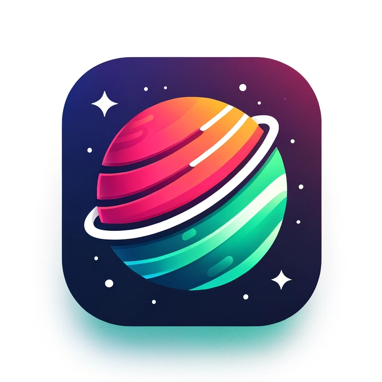
One mark exists: the ringed planet. Everything protecting it is proposed and awaits review.
Clear space & minimum sizes [invented]
The inventory, honestly
The app icon is the only mark in the source. It ships as the launcher icon on every platform (flutter_launcher_icons → assets/icon/icon.png) and doubles as the avatar crop — it is already square, ringed, and legible small.
Do
- Keep the ring intact — it is the signature stroke.
- Place the mark on space, paper, or opal tint.
- Use the rounded-square crop as the social avatar as-is.
- Scale from the source PNG; request vector redraw for print.
Don't
- Recolor the planet into a single gem color.
- Rotate the ring's angle or remove the stars.
- Set it over the planet gradient or busy imagery.
- Stretch, add drop shadows beyond the token scale, or outline it.
Section 03 · proposed · extracted verbatim from lib/theme/theme.dart
Color
Seven gemstones, each cut three ways — light, base, dark. The theme file names them like a jeweler; the guidelines keep it.
Emerald the accent — progress, growth, done
Ruby danger, error, close
Gold the flourish — suns, waves, rewards
Amethyst the planet's own purple — reserved
Sapphire links, information
Opal soft surfaces, calm tints
Onyx ink and structure
Surfaces
The planet gradient [derived: sampled from the icon]
Sunrise orange → pink → teal, 160°. Reserved for the mark's world: cover moments and hero accents. Never a component fill, never behind text.
Pairing & contrast — measured, sRGB
| Pair | Ratio | WCAG AA |
|---|---|---|
| Ink on Paper | 16.2 | PASS |
| Paper on Space | 14.4 | PASS |
| Onyx on Paper | 11.8 | PASS |
| Ruby on Paper | 8.4 | PASS |
| Sapphire on Paper | 7.2 | PASS |
| Gold on Space | 6.9 | PASS |
| Emerald on Space | 6.8 | PASS |
| Muted on Paper | 6.2 | PASS |
| Amethyst on Paper | 4.1 | LARGE ONLY |
| Emerald-dark on Paper | 3.7 | LARGE ONLY |
| Emerald on Paper | 2.1 | FAIL — decorative only |
Rule: body text is Ink on Paper or Paper on Space. Base emerald never carries text on white — use emerald-dark at large sizes, or put the text on space.
Section 04 · proposed · scale extracted, faces INVENTED
Typography
The app ships the system font — no family is declared anywhere in the source. The faces below are this run's proposal, loudly flagged.
Watch yourself flourish
hero · Space Grotesk 700 · clamp 40–72px
Welcome!
h1 · 700 · clamp 29–42px · app: 32 bold [context]
Today is Tuesday
h2 · 700 · clamp 22–30px · app: 24 [context]
Select habits you'd like to track.
h3 · 700 · clamp 18–22px · app: 18 [context]
Don't worry, you can always add custom habits later. Body text is Inter, 1.65 line height, never wider than 65 characters.
body · Inter 400 · 15–16px
Videos are limited to one minute. · caption / fine print — app: 14 and 10 [context]
caption · 400 · 12.5px
day 12 · streak 🔥 · lvl 47
mono · JetBrains Mono · counters & specs
Rules
- Bold carries hierarchy, not size alone. The app's scale is bold-heavy (32/24/18/14 all bold) — keep weight doing the work. [context]
- Sentence case everywhere. The app never shouts; headers read like a friend talking. [context: all app copy]
- Emoji sit inline with text and never get letter-spaced apart. [context]
- No faux bold, no stretching, no outlined text.
The A/B
This line is the system face — what the app actually ships today.
Honest trade-off: the system face costs nothing and matches the OS; Space Grotesk gives the brand a voice of its own on the web and in marketing.
Section 05 · proposed · extracted from app usage
Iconography
Two icon languages, deliberately split: Material icons run the chrome; emoji ARE the content.
Emoji as identity [context: every habit stores an emoji + a streakEmoji]
Each habit carries two emoji chosen by the user: its face and its streak flame. They appear at 24px inline with the habit name, and in celebration moments at 26–30px. The brand never redraws emoji — the platform set is the set.
Chrome icons [context: Material Icons — check, close, add]
Interface chrome uses the stock Material set, filled style, at 24px. Color rules extracted from the app: the confirm check is emerald on white, the close cross is ruby on white, everything else inherits text color. One accent icon per surface, maximum.
Section 06 · proposed · doctrine derived from the product itself
Photography & Illustration
Habit Planet's imagery is the user's own face: the Memento doctrine. The brand owns almost no other photography — honestly marked.
The Memento doctrine [derived: the video-memo feature is the imagery engine]
- Real, front-camera, unpolished. A Memento is one minute, portrait, shot at arm's length. Marketing that uses Memento-style footage keeps that grain — no ring lights, no scripts.
- Portrait, always. The app is orientation-locked; its imagery is too. [context: SystemChrome portraitUp]
- Product shots are device-framed. Screenshots ship inside a real device frame (iPhone / Nexus), never floating UI. [context: screenshots.yaml, frame: true]
- Illustration is cosmic, not cartoon. Where the brand illustrates, it draws the planet world: orbits, rings, star fields — in the gemstone palette on space.
REC · 0:37 / 1:00
"Day 30. Didn't want to run today. Ran anyway."
Section 07 · proposed · artifacts extracted, roles unknown
Mascots & Characters
No formal mascot exists — but the repo left three artifacts in orbit. Their roles are an open question, not an answer.

Until roles are locked
- The artifacts may appear in internal decks, labeled as candidates.
- Keep all three in the gemstone/space art direction if redrawn.
Not yet
- No artifact ships in the app or store listing before a lock.
- No new characters get invented to fill the gap.
Section 08 · proposed · anatomy extracted from widgets/, rebuilt live
UI Components
The app's real components, rebuilt in CSS from the tokens. Hover, press, and check them — these are not screenshots.
Habit entry card [context: habit_entry_card.dart]
Radius 10 · 2px ink line at 50% · elevation 5 · fill is the habit's own color as a 50%→30% gradient whose stop is the progress. Done cards go flat.
Checkbox · chips · input [context: stylized_checkbox / splash chips / theme inputs]
Selection is a full invert — white flips to ink, nothing in between. [context: splash_page.dart]
Inputs: 2px ink outline, 3px when focused, label always floating. Focus is visible or it doesn't ship. [context: theme.dart InputDecorationTheme]
The composite — a Today screen from these tokens, no images
Today is Tuesday
2 of 3 habits · lvl 47 · 1,204 xp
Section 09 · proposed · one elevation extracted, scale derived
Shadows & Borders
The app knows exactly one elevation — Material 5 — and one profound rule: finishing something removes its shadow.
Elevation
Soft ambient, never hard offset. Rest = the extracted elevation 5; lift is derived for pointer surfaces; done things rest flat [context: checkbox drops elevation 5 → 0 when checked]; glow is invented for accents on space and awaits review.
Radii & lines
8 chips · 10 cards [both context] · 16 media [derived] · pill buttons [proposed] · full round for the check, FABs, and everything orbital [context].
Lines: 2px ink at 50% on cards; 2px solid ink on inputs, thickening to 3px on focus — the border communicates attention, color does not. [context: theme.dart]
Section 10 · proposed · durations MEASURED from the app source
Motion
Two speeds: celestial and celebratory. Ambient motion breathes in tens of seconds; feedback pops in milliseconds; and levels rain for exactly three.
The rain — level up [context: level_up_overlay.dart — 30 emoji, 3s, staggered]
The celestial layer [context: orbital_indicator.dart]
The golden sine sway — 5s, ease-in-out, forever.
| Token | Value | Source |
|---|---|---|
| --dur-breathe | 20s | ring breathing cycle [context] |
| --dur-wave | 5s | sine sway [context] |
| --dur-enter | 2s | entry fade [context] |
| --dur-rain | 3s | level-up rain [context] |
| --dur-fast / normal | 150 / 300ms | doc micro-motion [invented] |
| --ease-celebrate | overshoot bezier | check-pop [invented] |
Sound is part of motion: pop on check, unpop on uncheck, a quiet shimmer under celebrations — always at whisper volume, and never over the user's own music. Haptics: light for navigation, medium for a check-in. [context: assets/audio + HapticFeedback calls]
prefers-reduced-motion: ambient layers stop dead, feedback becomes instant state change, the rain is skipped. Respected in this document — try it.
Section 11 · proposed · rhythm extracted, doc grid inherited
Layout
One column, one orientation, eight pixels. The app is a portrait scroll; the documents around it get a wider stage.
Spacing — 8px base [context: paddings observed at 8/16/24]
Portrait is law — the app locks orientation to portraitUp; brand layouts for screens follow. [context: main.dart]
Containers — web & docs [proposed: house defaults]
Screen edges get 24px padding [context: splash page]. Sections alternate paper / opal tint, with space reserved for the cover and motion. Body prose never exceeds 65ch.
Section 12 · proposed · samples extracted VERBATIM from the app
Voice & Tone
A coach who believes in you and will absolutely call you out. Warm by default, blunt when you cheat.
The voice, in its own words
"Transform your life, one habit at a time!"store pitch — now.md [context]
"Don't worry, you can always add custom habits later."onboarding — splash_page.dart [context]
"You're a liar, that's in the future."error state — habit_entry_card.dart [context]
Three registers, one throat: aspirational in marketing, reassuring in onboarding, dead honest in errors. The blunt line is the signature — errors tell the truth with a smirk, never with shame.
Habit vocabulary borrows from the 7 Habits tradition — "Be Proactive", "Begin With The End In Mind", "Put First Things First" ship as starter habits. [context: tooltip_text.dart]
Tone by context [proposed]
| Context | Tone | Sounds like |
|---|---|---|
| Store / marketing | Aspirational, benefit-first | "Step into a better you." |
| Onboarding | Reassuring, low-pressure | "Don't worry —" |
| Daily use | Brief, factual, warm | "Today is Tuesday." |
| Celebration | Loud, earned | "LEVEL 48 🎉" |
| Errors / cheating | Blunt, funny, never mean twice | "That's in the future." |
Words we use
- Memento (never "video note")
- check in · streak · level
- flourish, grow, orbit
Words we don't
- grind, crush it, optimize
- fail / failure (a missed day is a missed day)
- premium, unlock (it's free)
Vocabulary lists are [proposed] — approve or edit at review.
Section 13 · proposed · NOTHING extracted — the repo is silent on AI
AI Policy
The source predates the question and takes no stance. The position below is a draft default, not a decision.
AI-assisted, human-kept. Your habits are yours; your Mementos never leave your device.
| Surface | AI stance [proposed] |
|---|---|
| Building the product | Welcome — AI-assisted development, human-reviewed before ship. |
| Marketing copy & art | Permitted with disclosure; the app icon itself is AI-era art and is labeled as such here. |
| Habit suggestions in-app | Permitted if ever added — labeled, optional, never default-on. |
| User Mementos & habit data | FORBIDDEN as AI input. Local-first is the covenant — no third-party AI tool ever sees a user's videos or record. |
Disclosure rule [proposed]: when AI contributed materially to published content, say so in one plain line. No badge soup, no hedging — one line, same voice as everything else: honest.
Section 14 · proposed · placement is the open question
Sub-brands & Ecosystem
Habit Planet is a pre-Potatuhs artifact now staged inside the Potatuhs universe. Where it hangs on the tree is unresolved — deliberately.
What is known
- Origin
- Built as daily-video-recordings, renamed Habit Planet (pubspec: habit_planet, v1.0.3+4). Solo Flutter app, local SQLite, no backend. [context]
- Internal sub-identity
- Mementos — the video-memo feature has its own name and its own golden-ring artwork; treat it as a named feature, not a separate brand. [context: memento.dart + mementoh art]
- Staging
- Scanned from potatocore/brands/_source/habit-planet; published to the brands.potatocore.com gallery beside Sod Tori. [context]
What is not
Section 15 · proposed · current state extracted, convention inherited
Asset Naming & Governance
Small repo, honest inventory: what exists, what it's called, and the one rule that keeps this document true.
Naming
Adopt the umbrella convention for all new brand assets {brand}-{category}-{label}-{variant}.{ext} — e.g. habitplanet-icon-planet-1.png. [proposed: Potatuhs house rule]
| Current asset | Status |
|---|---|
| assets/icon/icon.png | the mark — canonical [context] |
| assets/icon/elephant.png · mementoh.png | artifacts, roles open (section 07) |
| assets/audio/pop.m4a · unpop.m4a · shimmer.wav | the sound identity [context] |
| com.example.HabitPlanet | FAIL — placeholder Android application id; must be re-domained before any store release [context: build.gradle] |
The SSOT rule
- DESIGN.md outranks this website. The site renders the spec; when they disagree, the site is wrong.
- tokens.css / tokens.json are the machine contract. The Flutter theme (lib/theme/theme.dart) mirrors them after each lock — propagation is one-way, spec → app.
- Every section here is PROPOSED. Nothing locks until the owner has adversarially reviewed it; provenance tags ([context] / [derived] / [invented]) say exactly what was found versus made up.
Registry: brands.potatocore.com · this document: /brands/habit-planet/head/ · source scan: 2026-08-04.