INTER
Own the interval. invented — no tagline exists in the source; replace or bless
Section 01 · proposed
Brand Overview
An interval timer that treats time as the hero: one ring, one numeral, a sound for every transition.
Intervolition is a native iOS interval timer by Owers LLC (Brett Owers, Feb 2025). It ships four ways of slicing time — the Intervalition sketch session, Tabata, Pomodoro, Spartan — plus a Day Mode that scores an entire day with scheduled sound cues. It lives on the lock screen and in the Dynamic Island as much as in the app. context
- Mission invented
- Make deliberate time visible — one interval at a time, announced out loud.
- Vision invented
- The metronome for anyone who structures their day into intervals — training, drawing, deep work, and the whole day itself.
- Audiences derived from the four factory presets
- Athletes (Tabata, Spartan) · artists on timed sketch pages (Intervalition) · focus workers (Pomodoro) · day-structurers (Day Mode).
Personality invented — bless or rewrite
- Precise
- Numerals are monospaced, rings are geometric, seconds are never approximate.
- Audible
- The brand speaks in 46 named sounds before it speaks in words.
- Unhurried
- It counts fast intervals calmly — ease curves, soft haptics, no alarm panic.
- Dual-natured
- A black precision instrument by default; a warm Potatuhs skin by choice.
Construction principles — live
-
Time is the hero
The numeral is the largest thing on any surface, always monospaced, always bold. Everything else — labels, buttons, even the ring — is supporting cast. context: 50pt mono bold numerals
-
One ring tells the truth
Progress is a single stroked circle: round caps, starts at twelve, sweeps clockwise, stroke = diameter ÷ 15. No bars-on-rings, no double dials. context: ArcProgressView
-
Sound is interface
Every transition has a named cue; users compose their own audio identity per timer. The default sentence: EDM to begin, Arp on work, Pinball on rest. context: AudioSounds + factory presets
EDM → Arp → Pinball → Ring
-
Two skins, one skeleton
Every value routes through the theme; the app re-renders whole between Dark and Potatuhs without a single component change. This document does the same. context: AppTheme.ThemeMode
Section 02 · proposed
Logo System
The mark is the instrument itself: a progress ring around a countdown numeral on a black field.
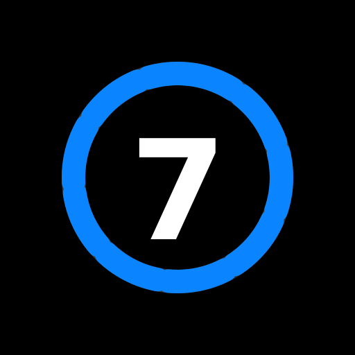
Clear space & minimums
Proposed clear space: twice the ring's stroke width on all sides — the unit is derived from the mark itself. invented rule Minimum sizes: invented 24px screen / 12mm print — the numeral must stay legible.
Do
- Keep the ring open — the gap is the mark's breath; a closed circle is a different logo.
- Set the numeral in the time face, bold.
- Use ring colors from the token set only (accent blue; Potatuhs orange in the warm skin).
- Keep the black field when placing on light or busy backgrounds.
Don't
- Don't rotate the start point away from twelve o'clock.
- Don't square the stroke caps — they are always round.
- Don't fill the ring's center with color or imagery.
- Don't stretch, add shadows, or outline — the brand owns zero shadows (see 09).
- Don't typeset the name in both spellings in one surface.
Section 03 · proposed
Color
Two complete skins extracted from AppTheme.swift — plus a semantic layer that tells time what it means.
The Dark skin — default context
The Potatuhs skin context — exact hex from source
The interval gradient context
Orange → amber → gold, vertical, top to bottom. It exists only in the Potatuhs skin and only as an accent surface — never behind body text.
Interval semantics context: names derived: hex
| Active | green · flame.fill |
| Inactive | orange · pause.fill |
| Break | blue · cup.and.saucer.fill |
| Countdown | purple · timer |
Pairing & contrast — measured, honestly derived: WCAG ratios computed this run
| Pairing | Ratio | AA body (4.5) | AA large (3.0) | Rule |
|---|---|---|---|---|
| Text on black | 18.0 | pass | pass | Default dark pairing. |
| Blue on black | 5.4 | pass | pass | Accent text allowed on dark. |
| Ink on cream | 16.1 | pass | pass | Potatuhs body pairing. |
| Gray on cream | 5.3 | pass | pass | Secondary text. |
| Orange on cream | 3.2 | FAIL | pass | Large text and strokes only — never body copy. |
| Ink on orange | 5.0 | pass | pass | The app's own active-label pairing [context] — it chose ink, not white. Keep that. |
Tint ramps beyond orange→amber→gold: none exist — placeholder. Hover/pressed states currently derive from the 20% fill rule (see 08), not from ramps.
Section 04 · proposed
Typography
Three voices of one system family: Rounded for identity, Mono for time, System for interface. context
Rounded
The identity voice — the splash wordmark: 40pt bold rounded. Web stack: ui-rounded → Nunito derived.
12:00
The time voice — every numeral, monospaced bold, tabular. Nothing else may be mono'd casually.
System
The interface voice — SF defaults for labels, forms, settings copy. It stays invisible on purpose.
Hierarchy — set live from tokens
42
1:07
Own the interval
Pomodoro · Round 4 of 8
When enabled, other audio will be briefly dimmed while interval sounds play.
07:00 · Bird · every day
The open call: which face owns time?
The app sets numerals in mono; the wordmark is rounded. A rounded time face would unify the voices but soften the instrument. Flip it live — every numeral in this document re-renders:
0:19
Don't
- Don't set time in a proportional face — colons must not wobble.
- Don't fake the rounded face with border tricks or faux-bold.
- Don't exceed two voices on one surface (time + one other).
- Don't letter-space the mono numerals.
Section 05 · proposed
Iconography
SF Symbols, exclusively — filled variants, tinted by role, sized at half their container. context
start · play.fill
pause · pause.fill
stop · stop
reset · restart
add · plus
edit · pencil
sound · speaker.wave.2.fill
yield · exclamationmark.octagon.fill
silence · speaker.slash.fill
skip · arrowshape.right.fill
previous · arrowshape.left.fill
down · chevron.down
- Source
- Apple SF Symbols only — no custom set, no third-party library. The glyphs above are web stand-ins; on Apple platforms use the named symbols verbatim. context
- Geometry
- Icon renders at 50% of its circular container's diameter; containers come in 30 / 44 / 58pt. context: CustomButton
- Color
- Icons always take their role's semantic color at full strength, on the same color at 20% fill. Never on gradients.
Don't
- Don't mix outline and filled variants on one surface — prefer filled.
- Don't draw custom glyphs when an SF Symbol exists.
- Don't tint an icon a color its role doesn't own.
- Don't scale icons past 50% of their container.
Section 06 · proposed
Photography & Illustration
The source contains zero photography and zero illustration. The interface is the imagery.
- Proposed stance invented
- Interface-first: screenshots, the ring, and live numerals are the brand's imagery. If human photography ever enters, it shows people mid-interval — chalk on hands, pencil on page 17 of 32 — never posed "after" shots.
- Proposed qualities invented
- In-progress · single-subject · hard directional light (a timer casts a shadow) · time visible somewhere in frame.
Section 07 · proposed
Mascots & Characters
Intervolition has none — a deliberate position, not an omission.
The app is a precision instrument; no character appears anywhere in it. context Proposed stance: it stays that way. The instrument's neutrality is what lets athletes, artists, and focus workers all project their own practice onto it. invented
- The one exception invented rule
- If the Potatuhs skin ever deepens into a full Potatuhs edition, parent-brand characters may appear in marketing for that edition only — never inside the timer surface, never near the ring.
- If a character is ever proposed
- It must survive this test: does it make an interval easier to start? A mascot that decorates but does not start timers is denied.
Section 08 · proposed
UI Components
Extracted live: press, hover, and flip everything on this page. Depth is a 20% tint, never a shadow.
Interval-type labels context: IntervalTypeLabel
Padding 12×6 · radius 10 · active = accent fill + bold; the swap animates at 300ms ease-in-out. Press one.
Circular controls context: CustomButton
go · 58
halt · 44
accent · 44
shift · 44
silence · 30
| Shape | Perfect circle; 30 / 44 / 58pt; icon at 50%. |
| Rest | Semantic color at 20% fill; glyph at 100%. |
| Hover invented — iOS has none | Fill deepens to 30%. |
| Pressed | Scale 0.92, 200ms ease-out. |
| Focus | 2px accent outline, 2px offset — visible always. |
In situ — same tokens, no images
Pushups · Sketch Page 4
Section 09 · proposed
Shadows & Borders
The elevation language is: there isn't one.
Zero shadow calls exist in the entire app. context: repo-wide grep Depth is communicated by fill opacity (the 20% rule) and by color, never by elevation. This is a brand fact: the instrument is flat because time is flat.
- Shadow scale
- --sh-none: none — the complete scale.
- Borders
- The app draws none; this document uses a single 1px hairline for structure. invented, doc-only
Radius scale — live corners context: 4 / 8 / 10 xl invented
Section 10 · proposed
Motion & Sound
Three durations, two curves, one choreography — and a 46-cue vocabulary that is the brand's actual voice.
| Token | Value | Used for |
|---|---|---|
| --dur-fast | 200ms | arc opacity swap |
| --dur-normal | 300ms | label & type swaps |
| --dur-slow | 500ms | arc progress step · view crossfades |
| --dur-fill | 3000ms | the splash ring fill |
| --ease-in-out | easeInOut | state swaps |
| --ease-out | easeOut | progress, presses |
The splash choreography context: SplashScreenView
Intervalition
The audible layer — 46 named cues context: AudioSounds + Resources/*.wav
Every cue is one TitleCase word, one .wav. The factory sentence is highlighted. Haptics ride along: soft for ticks, medium for transitions context: HapticManager. Audio files were not copied this run (shell denied) — cues render as inventory, not players.
- Accept
- Alarm
- Arp — active starts
- Bark
- Beep
- Bell
- Bing
- Bird
- Boom
- Chord
- Church
- Clap
- Click
- Crackles
- Crowd
- Drop
- Eagle
- EDM — countdown
- Fireworks
- Gong
- Honk
- Keys
- Kids
- Lady
- Lighter
- Lock
- Log
- Pinball — rest starts
- Ping
- Pump
- Punch
- Rev
- Ring — ending warning
- Rip
- Riser
- Robot
- Spent
- Synth
- Tennis
- Throw
- Typing
- Upbeat
- Whale
- Whistle
- Woodpecker
- Zip
Reduced motion: respected — reveals render immediately, loops stop, transforms collapse; opacity changes remain. invented policy; the app predates one
Section 11 · proposed
Layout
The ring is the layout: one centered column, breathing space above and below, the numeral in the middle.
The app composes every screen as a single vertical stack with spacers pushing content to the optical center — no grids, no sidebars, no density. context: Spacer-driven stacks The document you're reading adds a conventional web frame around that idea. doc scale invented
Containers
Spacing — 4pt base proposed; app anchors: 6, 12, 16pt
- Section rhythm
- clamp(4rem, 8vw, 7rem) vertical padding; hairline dividers; backgrounds alternate surface / tint / showcase.
- The center rule
- Anything that tells time sits on the horizontal center line. Controls flank it; labels crown it.
Section 12 · proposed
Voice & Tone
One-word imperatives on the surface; calm full sentences underneath.
The extracted voice has two registers. Controls speak in single words — and the words are unusual: Yield, not "warn"; Silence, as a verb. Explanations speak in complete, unhurried sentences that state the trade-off. context: ButtonType titles, settings copy
Controls — verbatim from source
Start · Stop · Pause · Reset · Yield · Silence · Skip · Previous
Settings — verbatim from source
"When enabled, other audio (music, podcasts) will be briefly dimmed while interval sounds play. Disable this to keep your music at full volume."
Marketing sample invented
Thirty-two sketch pages. Sixty seconds each. Begin.
| In-timer | Silent. The sound cue is the message; text never interrupts an interval. |
| Settings | Plain, complete sentences; name the trade-off, let the user decide. |
| Marketing | Short declaratives, numbers first, end on an imperative. |
| Errors | State what stopped and the single action that resumes. No apology theater. |
Words we use
- interval · round · cue
- begin, yield, silence
- numbers, written as numerals
Never
- "crush / grind / beast mode"
- "just 5 more!" — no pleading
- exclamation points in-app
Section 13 · proposed
AI Policy
No stance exists anywhere in the source. This page is a drafted position awaiting the owner's word.
AI-assisted. Human-shipped. invented — a proposal, not a policy
Proposed reading: AI participates in building Intervolition (code, copy drafts, this document); a human decides what ships, and the timer itself contains no generative features — it is deterministic by design.
| Surface | AI allowed? |
|---|---|
| Engineering & refactors | yes — reviewed |
| Copy drafts, docs | yes — human-edited |
| Sound cues | no — recorded/curated by a human ear |
| The timer's behavior | no — deterministic, always |
Section 14 · proposed
Sub-brands & Ecosystem
The source encodes its own family tree: a theme literally named "Potatuhs."
The Potatuhs relationship today is exactly one enum case deep: the tri-orange skin is opt-in, and the default experience carries no parent branding.
- Shared core (proposed)
- If (b) or (c): the tri-orange tokens and cream/ink pairings are imported from potatuhs-design, never redefined here.
- Allowed deviation (proposed)
- The dark instrument skin remains Intervolition's own in every scenario — the parent has no black-field precedent.
Section 15 · proposed
Asset Naming & Governance
The system that keeps this document true after today.
Naming
- Sound cues context
- One TitleCase word, .wav, name = the enum case: Woodpecker.wav. New cues follow or are renamed.
- Brand assets proposed, per the Potatuhs convention
- intervolition-{category}-{label}-{variant}.{ext} — e.g. intervolition-icon-ring-dark.svg.
- Exports
- SVG for marks, PNG at 1024 for the App Store icon, WAV 16-bit for cues. proposed
The SSOT chain
| DESIGN.md | The spec. Outranks this site; the site renders it. |
| tokens.css / tokens.json | The machine contract, generated together, never apart. |
| AppTheme.swift | The iOS consumer. On change: edit spec → regenerate tokens → mirror into the enum. Today it is upstream (this doc was extracted from it); after lock the direction reverses. |
Every section on this page is PROPOSED — nothing is locked. Asset exports (like assets/mark.svg) necessarily bake token values; regenerate them when tokens change.