BRAND GUIDELINESv2.0 — DRAFT2026-07

Tomatuhs

We’re growers. We like to grow.

    Proposed — awaiting lock

    01 · Brand Overview

    Turn the grow-curious into growers.

    Why Tomatuhs exists, who it serves, and the rules of its visual world answered — from the questionnaire.

    Tomatuhs exists to compel the grow-curious to grow their own food. We sell grow kits — but the product is the moment someone decides to grow. The brand is fresh, Latin, and simple: a calm, luxurious frame around culture-specific craftsmanship. Rome grew all over the world. Mexico has deep roots in agriculture. Growth is the whole story.

    Personality answered

    Fresh
    Market-morning clean; daylight surfaces; nothing heavy, nothing stale.
    Simple
    Nothing too complicated — Apple's restraint; the frame never competes with what it holds.
    Prideful
    Hunt's-style pride in the work; the craft is the credential.
    Growing
    Everything emphasizes growth — motion, imagery, narrative, even the mascot question.

    Audience answered

    The grow-curious
    People who haven't grown food yet but feel the pull. Every surface is a conversion surface: it should make growing feel possible and near.

    Construction principles answered — phrasing drafted

    1. Simple frames, Latin trophies

      The Latin bears the trophy — it does not compete. Restraint is the frame; craftsmanship is what's framed.

    2. Culture-specific, never blended

      If it's Italian, it's Italian. If it's Mexican, it's Mexican. No pan-cultural mush.

    3. Real over rendered

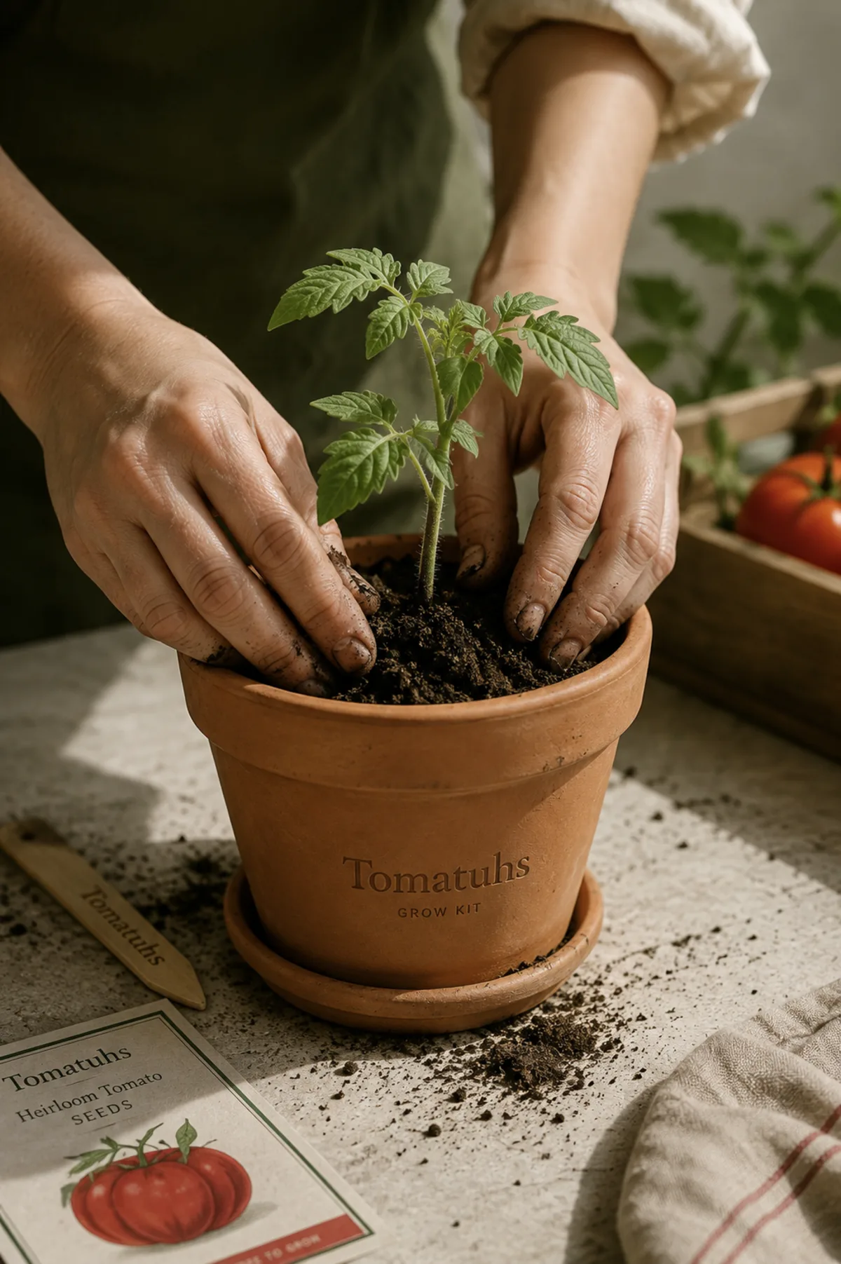
      The imagery is photographed: real soil, real hands, real vines.

    4. Everything grows

      Motion grows in, narratives move toward harvest, nothing punches or snaps.

    5. Red, white, green

      The entire chromatic identity. Festival accents visit; the tricolor stays.
    Proposed — awaiting lock

    02 · Logo System

    A quiet mark for a proud name.

    No drawn mark exists; the typographic wordmark is the draft invented — simple-frame rule applied: one color, set in the display face. The tricolor appears in the world around the mark, not inside it.

    Tomatuhs
    Primary — Soil ink on light surfaces
    Tomatuhs
    Reversed — Field White on Deep Field
    Tomatuhs
    Accent — green “tuhs”, for brand-owned surfaces only
    T
    Avatar — green field, white T

    Protection rules invented — confirm

    • Clear space on all sides equals the height of the capital T.
    • Minimum size: 24px on screen, 8mm in print.
    • One color at a time — ink, white, or the single green accent. Never tricolor letters.

    Misuse

    • Set in the display face, lowercase after the T
    • On photography, use white with a subtle scrim
    • No stretching, outlining, or effects
    • No rainbow or per-letter coloring
    • No busy backgrounds without a scrim
    PLACEHOLDER — no drawn mark exists. If one is commissioned (a vine device, a tomato silhouette), collect the file; never redraw from description.
    Proposed — awaiting lock

    03 · Color & Seasons

    Red, white, green — and the festivals that visit.

    The tricolor is yours answered; the exact values are drafted fresh and named plainly invented — scrutinize. Red drives appetite and action; green reads living and calm; the white is clean daylight, not cream.

    Primary palette

    Vine Red#D2232AThe fruit. Action, appetite, emphasis.
    Leaf Green#0E8345The living plant. Growth, labels, structure.
    Field White#FAFAF7Clean daylight. The default surface.

    Structural set

    Soil#1A1A18Text
    Linen#F4F2EAWarm surface
    Deep Field#0F2A1CDark surface
    Stone#6B6B64Secondary text
    Mist#E8E8E2Hairlines

    Pairing & contrast measured — WCAG, recorded honestly

    TextOn surfaceRatioAA
    SoilField White16.67Pass
    SoilLinen15.55Pass
    Field WhiteDeep Field14.68Pass
    StoneField White5.13Pass
    Vine RedField White5.00Pass (both ways)
    Leaf GreenField White4.62Pass (both ways)
    Vine RedDeep Field2.93Fail — banned
    Leaf GreenDeep Field3.18Fail — banned

    Festival colorways festivals answered · accents invented

    La TomatinaAugust — the red goes saturated; the one day the frame gets loud.
    Día de MuertosNovember — cempasúchil marigold joins the tricolor. Mexican, specifically.
    VendemmiaSeptember–October — Italian harvest; oak and linen warm the frame. Italian, specifically.
    • A festival accent is a guest: time-boxed, one per campaign, never added to the permanent palette.
    Proposed — awaiting lock

    04 · Typography

    Craft or clean — pick the display voice.

    Body text is Inter either way — the simple frame. The open call is the display face researched A/B — serif reads craft & heritage in food; sans reads modern & minimal.

    Preview site-wide:
    A — Fraunces We’re growers.

    Soft heritage serif — the Hunt's pride, the canning-label trust. Food-brand research favors serif for honesty and craft.

    B — Inter tight We’re growers.

    One family everywhere — the Apple frame taken all the way. Cleaner, cooler, gives up the craft signal.

    Hierarchy invented — sizes live in tokens.css

    Grow
    Heroclamp(3rem → 6rem) · 600 · displayCover statements only
    First harvest
    H1clamp(2.1rem → 3.3rem) · 600 · displaySection statements
    The kit on the sill
    H2clamp(1.7rem → 2.4rem) · 600 · displaySub-heads
    Seeds, soil, patience
    H31.3rem · 600 · displayCard titles
    Large body carries introductions at a comfortable size.
    Body large1.185rem · 400 · bodyIntros, subtitles
    Body is Inter at one rem, line height 1.6, never wider than sixty-five characters.
    Body1rem · 400 · bodyRunning text
    Captions annotate imagery and specimens.
    Caption0.8rem · 400 · mutedFigure notes
    Label
    Label0.72rem · mono · uppercase · 0.18emKickers, block labels
    • All-caps only at label size, in mono, wide-tracked
    • Headings balanced; prose ≤ 65ch
    • No stretching, faux bold, or outlined text
    • Never more than two families on a surface
    Proposed — awaiting lock

    05 · Iconography

    Fine strokes, kept quiet.

    Delegated — the draft: an open library (Lucide) configured fine and light for the luxurious frame invented — 1.5px stroke; custom set is the alternative.

    The set, configured

    sprout
    water
    sun
    tomato
    home
    roots
    guide
    care

    Geometry & rules

    PropertyValue
    Grid24 × 24 (Lucide)
    Stroke1.5px, round caps & joins — fine, quiet
    Sizes16 inline · 20 nav · 24 default · 32 feature
    ColorcurrentColor; Leaf/Vine only as status
    • Icons support; they never headline. If an icon competes with the photography, remove the icon.
    Proposed — awaiting lock

    06 · Photography

    Real. That was the whole answer.

    Real soil, real hands, real vines answered — photographed, not illustrated. Art direction drafted below invented.

    Qualities

    Natural light
    Daylight only — morning market, low sun. No studio strobes, no sterile white.
    Hands in frame
    The pride is visible: hands planting, tying, harvesting. Work, not lifestyle posing.
    Culture on location
    Italian is shot Italian; Mexican is shot Mexican. Real places, never a set dressed as "Latin".
    Growth visible
    Stages matter — seed, sprout, vine, fruit. Series over single shots.

    Formats

    Kit in use
    The grow kit on a real sill, a real balcony — the conversion image.
    Grower portraits
    Real customers with what they grew. Pride, eye level.
    Harvest table
    What the growing becomes — the kitchen, the sauce, the meal.
    Festival documentary
    The seasonal layer, shot on location at the festivals themselves.
    PLACEHOLDER — no photo library exists. Each format needs at least one exemplar shoot before this document is final.
    Proposed — awaiting lock

    07 · Mascots & Characters

    Torn — so here are both futures.

    The worry: cartoony. The want: growth answered. Two directions, side by side invented.

    Lean toward:
    A — The Stages

    Not a face — a life cycle. One botanical character drawn as four growth stages, rendered like seed-packet engraving, never cartoon. It grows across packaging, email sequences, and the kit instructions themselves.

    B — No mascot

    The grower is the character. Photography carries all personality (section 06: grower portraits), and the brand never risks cartoony at all. Apple has no mascot; neither does pride.

    PLACEHOLDER — if direction A wins, the character is commissioned from a real illustrator in the seed-packet engraving tradition; collect files, never generate a cartoon.
    Proposed — awaiting lock

    08 · UI Components

    Built to sell grow kits.

    The storefront is the first surface answered; the set is commerce-first invented.

    Buttons

    Product card

    First-timer friendly

    The Sill Kit

    Seeds, soil, pot, patience. Everything a first vine needs.

    $39

    Email field

    Focus the field — the visible ring is a rule, not decoration.

    Tags

    Heirloom First-timer friendly Small batch
    • Vine Red is the action color and only the action color — one primary button per view.
    Proposed — awaiting lock

    09 · Shadows & Borders

    Barely there, on purpose.

    Luxury sits flat — elevation whispers invented — from the simple-frame rule.

    Shadow scale

    Restcards, tiles
    Raisedoverlays, hover
    • One border weight: 1px Mist hairline. An edge is a border, not a shadow.

    Radius scale

    sm · 4
    md · 10
    lg · 18
    xl · 28
    pill
    LevelUsed for
    sm / mdInputs, buttons, tags, tiles
    lg / xlCards, panels, photography
    pillTags and avatar crops only
    Proposed — awaiting lock

    10 · Motion

    Grow-ins, never punch starts.

    Slow growth — subtle rustlings, not too slow answered.

    Named patterns

    Grow-inentrances rise from the ground — ease-grow, 520ms
    Rustleidle life — a degree or two of sway, never a wobble
    Ripenstate changes fade like color arriving — no snap

    Curves & durations

    TokenValueJob
    ease-outcubic-bezier(.25,1,.4,1)Settles, exits
    ease-growcubic-bezier(.3,1.2,.5,1)Organic entrances
    fast140msFeedback
    normal280msState changes
    grow520msEntrances, reveals
    • Transform and opacity only; 80ms stagger for lists.
    • Reduced motion: entrances visible, rustles stop.
    Proposed — awaiting lock

    11 · Layout

    The frame does the framing.

    Calm margins, one downward flow, density on desktop invented — from the simple-frame rule.

    Containers

    TokenWidthUsed for
    narrow44remProse, statements
    default64remSection content
    wide80remDesktop canvas, paired columns
    • Desktop first (~1280–1680px); mobile is a functional fallback.
    • One hero per view — the trophy rule applies to layout too.
    • Chapters divide with the tricolor hairline.

    Spacing scale

    sp-1 · 0.25
    sp-2 · 0.5
    sp-3 · 1
    sp-4 · 1.5
    sp-5 · 2
    sp-6 · 3
    sp-7 · 4.5
    sp-8 · 7

    Section rhythm: clamp(4rem → 6.5rem) per chapter.

    Proposed — awaiting lock

    12 · Voice & Tone

    We’re growers. We like to grow.

    The voice, verbatim answered — short declaratives, first person plural, pride without volume.

    Tone by context

    ContextTone
    StorefrontInvitational, concrete — the pot, the season, the price
    Kit instructionsPatient, step-by-step, encouraging
    ErrorsHonest, gentle, no blame
    Legal / opsClear. The voice steps aside

    Vocabulary

    • grow, tend, harvest, season, home, pride, real
    • hack, optimize, revolutionary, AI-powered, "last chance"

    Sample copy

    We’re growers. We like to grow.

    The line — verbatim answered

    You don’t need a garden. You need a sill, a seed, and a season.

    Grow-curious headline invented

    That didn’t take. Give it a moment and try again.

    Error message invented
    Proposed — awaiting lock

    13 · Sub-brands

    Three futures, one house.

    Named but not yet live answered — "down the line, not yet". Coding drafted invented.

    Tomatuhs Garden KitsThe core line — grows beyond the sill. Wordmark + plain descriptor, Leaf Green accent.
    reserved
    Tomatuhs SeedsHeirloom and regional varieties, culture-specific packaging. Wordmark + descriptor, Vine Red accent.
    reserved
    Tomatuhs Cultural PrideApparel celebrating specific cultures — Italian pieces Italian, Mexican pieces Mexican, per the never-blend rule.
    reserved
    • Endorsed house: always the Tomatuhs wordmark plus a plain descriptor — no sub-line gets its own logo until it earns its own audience.
    Proposed — awaiting lock

    14 · Naming & Governance

    One source, named plainly.

    How the system stays alive after this ships invented.

    Naming & formats

    PatternExample
    {brand}-{category}-{label}-{variant}.{ext}tomatuhs-mark-primary-ink.svg
    tomatuhs-photo-sillkit-morning.webp
    tomatuhs-fest-muertos-colorway.css

    Governance

    • `DESIGN.md` in this folder is the single source of truth; this site renders it; when they disagree, the site is wrong.
    • `tokens.css` is the machine contract — the storefront consumes it, never forks it.
    • Changes flow one way: spec + tokens here, then outward.