It Is
What
It Is.
The vocabulary app that teaches you the words you need to know — and charges you Nothing for the privilege. This document says which black is the black, why the borders are two pixels of white, and how to keep a straight face while selling the void.
Section 01 PROPOSED
Brand Overview
What the brand is, who it serves, and the rules everything downstream obeys.
The story context
What It Is is an AI-powered vocabulary app (repo: words_i_need_to_know). Learners follow Pathways — Topics that hold Glossaries that hold Words — and an AI defines, refines, and quizzes. The whole personality lives in one shrug: it is what it is. The interface is a black void, the type is enormous, and the in-app currency is literally called Nothing.
Mission & vision invented
Mission: put the words you actually need in front of you every day, defined plainly.
Vision: a world where nobody nods along to a word they don't know.
Audience invented
Autodidacts, professionals entering a new field's jargon, students prepping for exams, and anyone who collects words the way others collect coins. The app's README targets everyday learners on iOS and Android.
Personality invented — derived from real copy
- Deadpan
- The joke is never acknowledged. "Use Nothing to interact with AI. It is what it is." is real product copy.
- Literal
- Words mean what they mean — this is a dictionary company. The brand takes idioms at face value and keeps walking.
- Frank
- Short sentences. No hype. The tour button says "Tour". The back button tooltip says "Back button".
- Void-positive
- Black is not an absence here; it is the product surface. Nothing is not a lack; it is the currency.
- Quietly absurd
- Six escalating tiers of Nothing exist and each one costs more. Nobody in the interface finds this funny.
Construction principles — live invented — each demo runs on extracted tokens
-
White line on black void
Structure is drawn, never filled. A surface earns a 2px white border instead of a background change.
This frame is the whole design system. Hover it. -
Square by default
Corners are 0. Radius is reserved for one thing only: surfaces that touch Nothing (the currency).
UI$ -
Say it plainly, then stop
Copy states the fact and ends. No exclamation points, no winks, no second sentence where one will do.
Nothing. In App Currency.
-
Nothing is the product
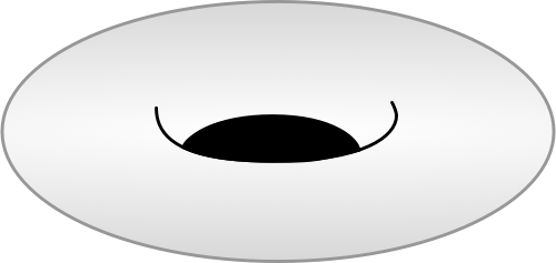
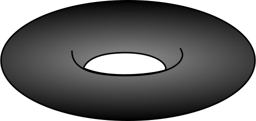
The void is rendered as an object — a coin with a hole where the value should be — and sold sincerely.
Section 02 PROPOSED
Logo System
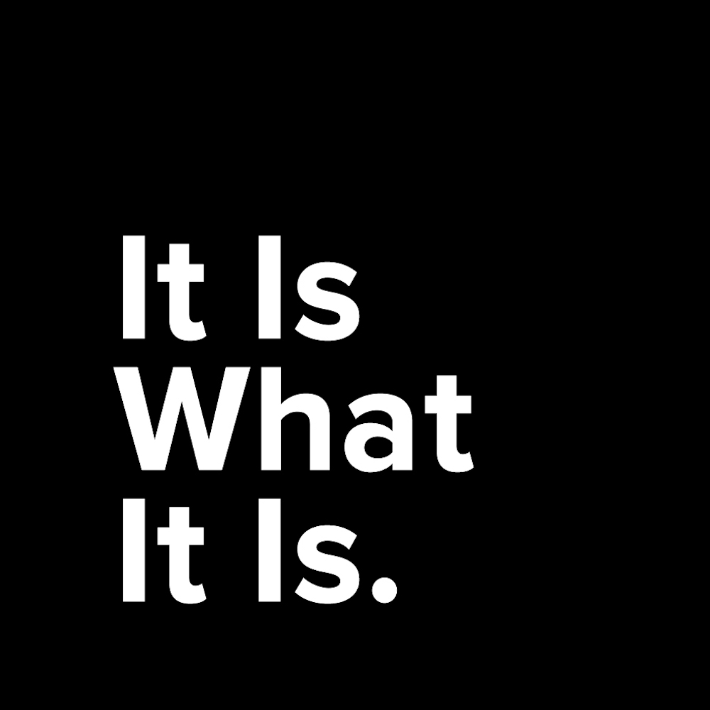
One mark exists: the stacked wordmark, white on black, ending in a period. Everything else in this section protects it.


Construction context — read from the artwork
- Three lines, ragged right: It Is / What / It Is.
- Always left-aligned. The mark never centers.
- The period is part of the mark. It is the shrug.
- White on black. No other color combination is on record.
Clear space & minimum size invented
What
It Is.
Unit ×: the cap height of "It". Minimum size — screen 96px wide, print 20mm. Both values are proposals, not measurements.
Backgrounds
- Pure black (#000000) — primary context
- Void surfaces #121212–#45474C — permitted invented
- Photography / busy texture — never invented
Misuse invented — rendered live in type, not screenshots
What
It Is.
What
It Is.
What
It Is.
What
It Is
What
It Is.
What
It Is.
Section 03 PROPOSED
Color
Extracted verbatim from lib/global/theme.dart → darkThemeDefault. The brand is a black void, a white line, a family of golds, and paper-pale accents. There is no light theme.
The void ramp — eight working darks context
#121212
canvas
#151515
app bar
#181818
bottom bar
#222327
tab bar
#303238
card
#313538
primary
#353535
disabled
#45474C
raised card
Ink & the gold trio context
Paper accents — light values on dark context
Pairing & contrast — measured, WCAG 2.1 derived — ratios computed this run
| Pair (live) | Ratio on #121212 | AA body | Rule |
|---|---|---|---|
| Ink on void | 18.7 : 1 | PASS | Default for all reading text. |
| Muted on void | 6.8 : 1 | PASS | Captions and secondary lines. |
| Gold on void | 11.7 : 1 | PASS | Icons, dividers, kickers. |
| Gold Bright on void | 11.4 : 1 | PASS | Selected / active states. |
| Parchment on void | 15.6 : 1 | PASS | Rare warm emphasis. |
| Blue Mid on void | 12.6 : 1 | PASS | Subtitles, selection. |
| Red on void | 4.4 : 1 | FAIL (4.5 needed) | Red is a highlight background behind white text, never body text on void. Large text only. |
| Abyss 2 on void | 2.3 : 1 | FAIL | Decorative only. Never text. |
| Void on parchment | 15.6 : 1 | PASS | Snackbar / banner text. |
| Void on gold bright | 11.4 : 1 | PASS | Filled action states. |
| Muted on card #303238 | 4.7 : 1 | PASS (barely) | Do not go dimmer than muted on cards. |
Gradient rule
Surfaces are flat, always. Soft gradients exist only inside object renders (the Nothing coin's sheen) — never on backgrounds, cards, or text. context: no surface gradient anywhere in theme.dart
Section 04 PROPOSED
Typography
Two voices: a heavyweight display that shouts, and Poppins that explains. Both are in the source — the pairing rule is this document's proposal.
Words you need to know.
Poppins carries every sentence like this one — 18px body, geometric, unbothered. context: theme fontName "Poppins", GoogleFonts.poppins body1
Faces
- Display — Arial Blackcontext: assets/fonts/ariblk.ttf
- Body — Poppins (300 / 400 / 600)context
- Web display stand-in — Archivo Blackinvented
Rules invented — quirks are context
- Display casing: Title Case with the period. Never all-caps.
- Display tracking +0.75px context: displayLarge
- Labels may track −1px tight context: titleMedium/overline
- Overlines are underlined in Blue Deep context
- Max two weights per surface. No faux bold, no outline text.
Hierarchy — live, values from theme.dart context
Section 05 PROPOSED
Iconography
No custom set. The app uses stock Material Icons, filled style, and makes them its own with one move: gold. context: IconThemeData(color: #FFC107, size: 32)
The configuration
Sizing context: default 32
20 · 24 · 32 (default) · 48
Color rules context + invented boundaries
- Body icons: Gold Amber #FFC107
- App-bar icons: Gold #EBC878
- Selected tab: Gold Bright #FDC100
- Icons never sit on gold fills (gold-on-gold is invisible)
- No outlined/two-tone Material variants — filled only invented
Section 06 PROPOSED
Photography & Illustration
This brand does not photograph. Its imagery is a single skeuomorphic gesture: the void rendered as a physical object, floating on flat black or flat white.
The render style — real assets context

Art-direction qualities invented — derived from the asset set
- Object on void
- One subject, dead center or stacked, infinite empty background. Never a scene, never a prop.
- Soft where it must be
- Gradients live inside the object (the coin's sheen) — the only place softness is permitted in the entire system.
- Played straight
- The renders are product photography of nothing. Lighting is sincere, e-commerce grade. The comedy is structural, never styled.
Section 07 PROPOSED
Mascots & Characters
There is no cartoon mascot. There is a currency with a personality: Nothing, sold in six escalating denominations, each rendered with total sincerity. context: assets/images/nothing/ + in-app product tiers
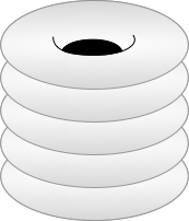
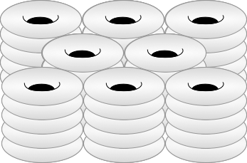
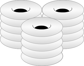
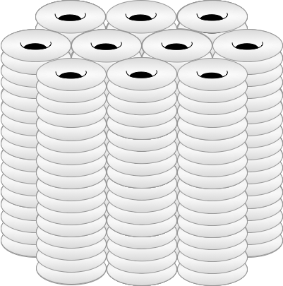
Tier names are product truth [context]; the one-line roles are proposals [invented].
Usage rules invented
- The coin appears wherever value is exchanged: store, rewards, ads.
- Nothing never gets a face, eyes, or limbs. It is an object, not a friend.
- Stack heights are meaningful — never resize a tier's render to fit a layout.
- Legal, auth, and error surfaces stay coin-free.
If a character ever appears
The bar: it must be describable in one deadpan sentence and survive being taken literally. Anything cuter than the coin is off-brand. invented
Section 08 PROPOSED
UI Components
Rebuilt live from the Flutter widgets, on these tokens. Hover and press everything. context: what_it_is_button.dart, details.dart, in_game_currency_page.dart
The Button
- Shapesquare, 2px accent border
- Filltransparent
- Hoveraccent at 50% (InkWell highlight)
- Activesolid accent, void text
- Focus2px gold-bright outline, offset 3
The source is split — white buttons, gold icons. Flip B and every interactive accent in this document goes gold.
The Details Panel
Nothing
In App Currency
Use Nothing to interact with AI. It is what it is.
Title in display face, grey subtitle, Poppins body — the app's core content frame. Search matches highlight in red: like this.
The Currency Card
More Nothing
$1.99
The one rounded component in the system — radius 20 marks surfaces that touch Nothing.
In situ — same tokens, no images
The brand as product: app bar on void-1 with a gold icon, a Details panel, the square button, gold-bright selected tab. Everything here reads from tokens.css.
Rhetoric
Glossary · 26 words
Anaphora. Chiasmus. Zeugma. Words for saying things well.
Section 09 PROPOSED
Shadows & Borders
Elevation barely exists in a void — three pure-black 8px-blur shadows, one white line weight, one gold divider. context: theme.dart BoxShadows, DividerThemeData
The three shadows — live
cards at rest
app bar, soft lift
bottom sheets
Borders
- Structural frame2px solid ink [context]
- Hairline (currency card, tables)1px solid ink [context]
- Divider3px solid gold #EBC878 [context]
Radius scale
everything
currency
ad frame
Radius is semantic, not decorative: 0 is the brand; 20–22 marks commerce surfaces; pill exists only on slider thumbs (r15). context
Section 10 PROPOSED
Motion
Three patterns exist in source: routes fade in, loading shimmers, and text types itself out. No duration was ever written down — every number below is a proposal. context: AnimationEnum.fadeIn, flutter_shimmer, animated_text_kit invented: all values
It is what it is.
This paragraph faded in the way every page in the app arrives.
| Pattern | Property | Spec |
|---|---|---|
| fade-in (routes) | opacity | 480ms · ease-out |
| press feedback | background | 120ms · ease-out |
| shimmer (loading) | background-position | 1600ms · linear · loops |
| typewriter (AI text) | width | 150ms/char · steps() |
| reveal stagger | delay | 60ms increments |
Reduced motion
Respected, fully: transforms and typing collapse to instant, shimmer stops, content renders visible. Opacity-only fades may keep a 1ms trace. This document itself obeys the rule — try it.
Personality
Motion is a shrug, not a bounce. Nothing springs, nothing overshoots. Things appear, plainly, and are then simply there. invented
Section 11 PROPOSED
Layout
The app is locked portrait, one column, framed in drawn borders. context: SystemChrome portraitUp; EdgeInsets 8/16/24/32 throughout
Spacing — 8px base derived
The app uses exactly 8 and 16 for padding, everywhere. The upper steps extend the scale for web/doc surfaces. invented above 32
The frame rhythm context
- One column. The app never goes two-column except the store grid.
- Content blocks are framed, not carded — border instead of fill.
- Doc containers: 46 / 72 / 88rem invented
Section 12 PROPOSED
Voice & Tone
The strongest thing extracted from this repo. The voice is deadpan literalism: state the fact, let the absurdity stand, end with a period.
State it plainly. Let it be funny on its own time.
Real copy — extracted verbatim context
"Use Nothing to interact with AI. It is what it is."
in_game_currency_page.dart — the currency pitch
"404. Not found. Void. Null. Empty. Nothing. Though closely related, these words all have different meanings. What is nothing if not at the very least a word? … Rather odd you're seeing this message. Please reach out to support!"
historyPageBody.dart — an error state that teaches vocabulary
"Tap Page" · "Tour" · "Back button" · "Nothing selected"
tooltips.dart — UI copy at maximum economy
Vocabulary invented — modeled on the extracts
ALWAYS IN
- "It is what it is." — the closing shrug
- Nothing, capitalized, as a product
- Plain verbs: tap, create, explore, define
- Full stops. Everywhere.
ALWAYS OUT
- Exclamation points (one legacy "support!" survives — fix it)
- Hype: unlock, supercharge, revolutionary
- Emoji, in any surface
- Explaining the joke
Tone by context invented
| Store | Driest. The prices do the comedy. |
| Learning flow | Warm-neutral. Never jokes about a word the user got wrong. |
| Errors | Literal, slightly curious, still useful (see the 404). |
| Legal / privacy | Zero voice. Plain legal English. |
Section 13 PROPOSED
AI Policy
The product is built on AI — words are defined, glossaries generated, and chat runs through OpenAI. The stance below makes that explicit. context: chatbot pages, openai_parameters_page, user-supplied API keys invented: the policy language
AI-native. Disclosed. It is what it is.
| Surface | AI role | Rule |
|---|---|---|
| Word definitions | Generated | Labeled as AI-generated; users can vote inaccuracies (README roadmap). |
| Glossary / pathway creation | Generated on request | User-initiated, user-owned, never shown to other users unverified. |
| Chatbot | Fully AI | Presented as a bot. Costs Nothing, literally. |
| Brand copy & marketing | Assisted | Human approves every published word. |
| This document | AI-composed | Marked PROPOSED until the owner reviews every section. |
Disclosure rule
The README's own backlog says "AI Disclaimer" — this section closes that item: any AI-defined word carries a quiet mark; the app never passes AI text as editorial fact.
Data stance
Users may supply their own OpenAI API key and org key (context: it's in the settings UI). Keys stay on device. Learner history is never sold, never used to train third-party models. invented — confirm the never-train clause
Section 14 PROPOSED
Sub-brands & Ecosystem
The repo names its relatives without diagramming them. This is the reconstruction.
The 101 motif context
101 is the ecosystem's number: 101 glossaries per pathway, 101 words per glossary, weare101.com as the storefront. Any future sub-brand inherits it as a limit or a name, not as decoration.
Section 15 PROPOSED
Asset Naming & Governance
The operational tail. Today the repo speaks two dialects — "More Nothing@2x.png" and "morenothing.png" name the same object. One convention wins.
Proposed convention invented — matches the Potatuhs house pattern
whatitis-{category}-{label}-{variant}.{ext}
- whatitis-logo-wordmark-onblack.png
- whatitis-currency-morenothing-2x.png
- whatitis-icon-app-maskable.png
Formats invented
| Marks | SVG master (to be drawn) + PNG @1x/@2x |
| Currency renders | PNG with alpha, never JPG |
| App icons | the existing web/icons matrix |
Governance
SSOT
DESIGN.md in this folder is the spec; this site renders it; tokens.css / tokens.json are the machine contract. When they disagree, the site is wrong. Changes land in DESIGN.md first, then tokens, then consumers (the Flutter app's theme.dart is consumer #1).